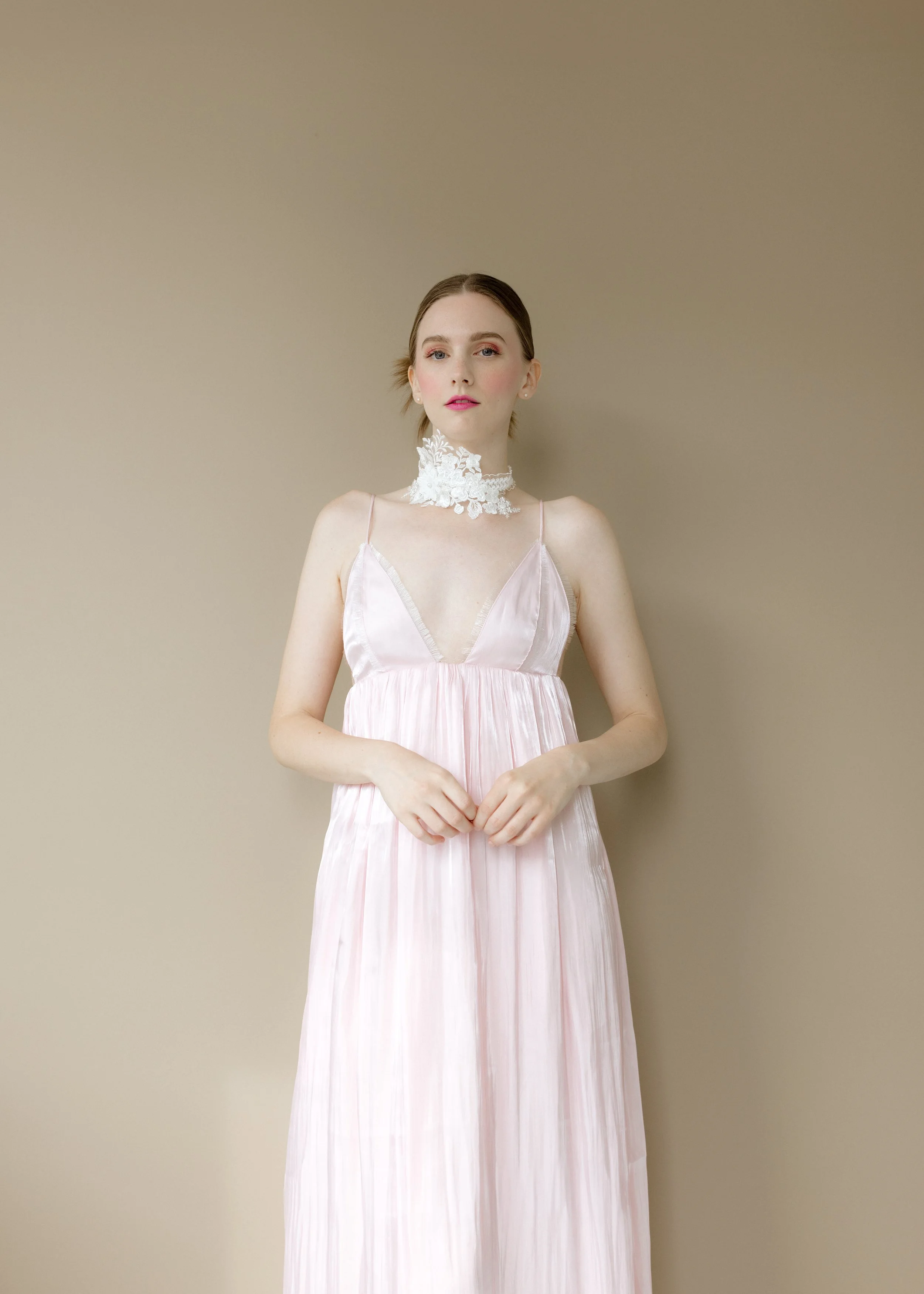
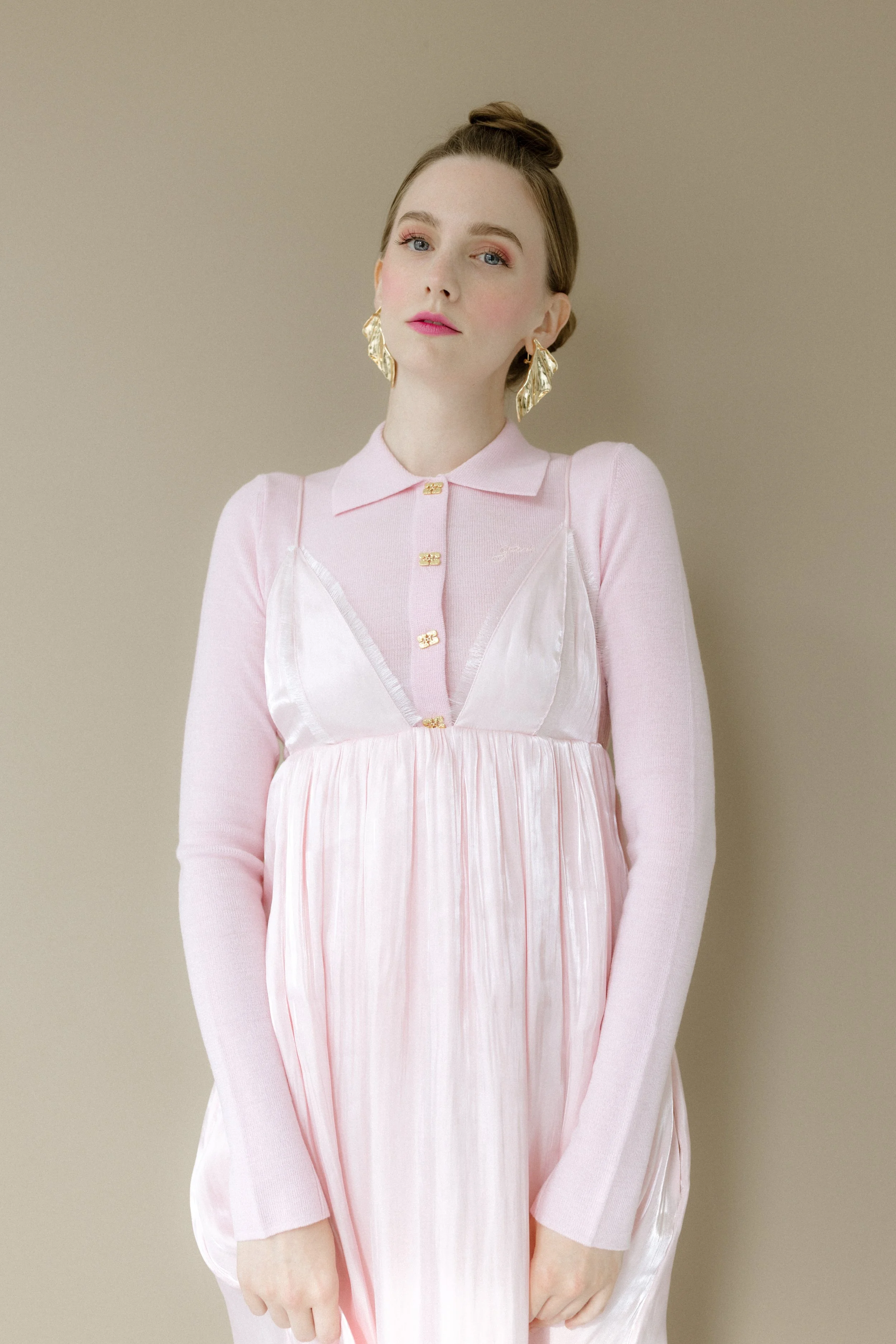
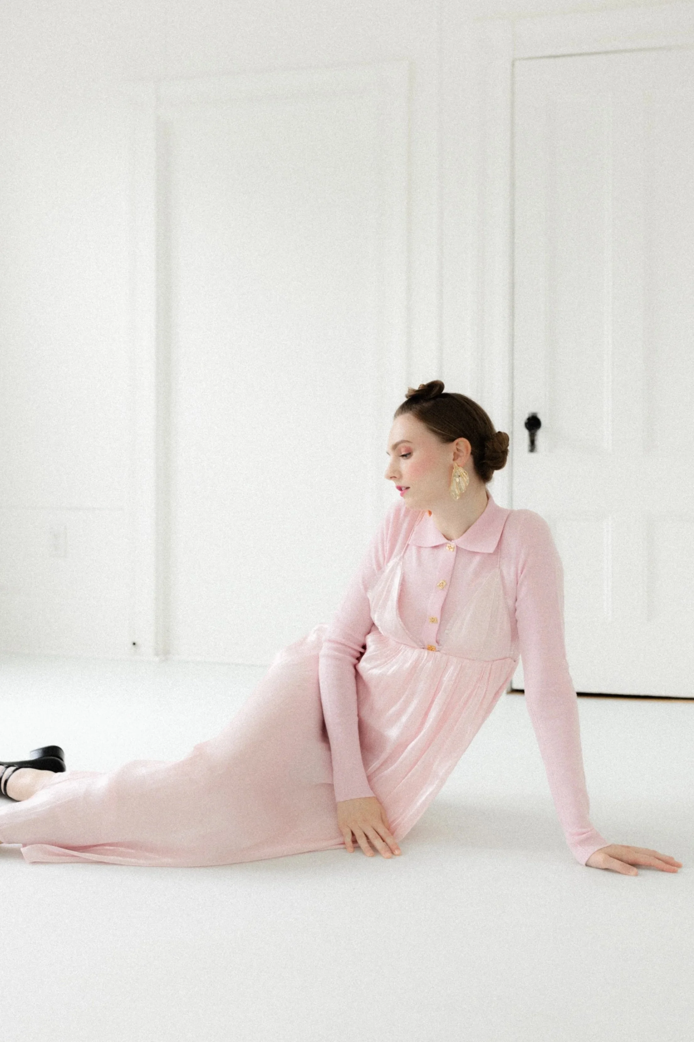
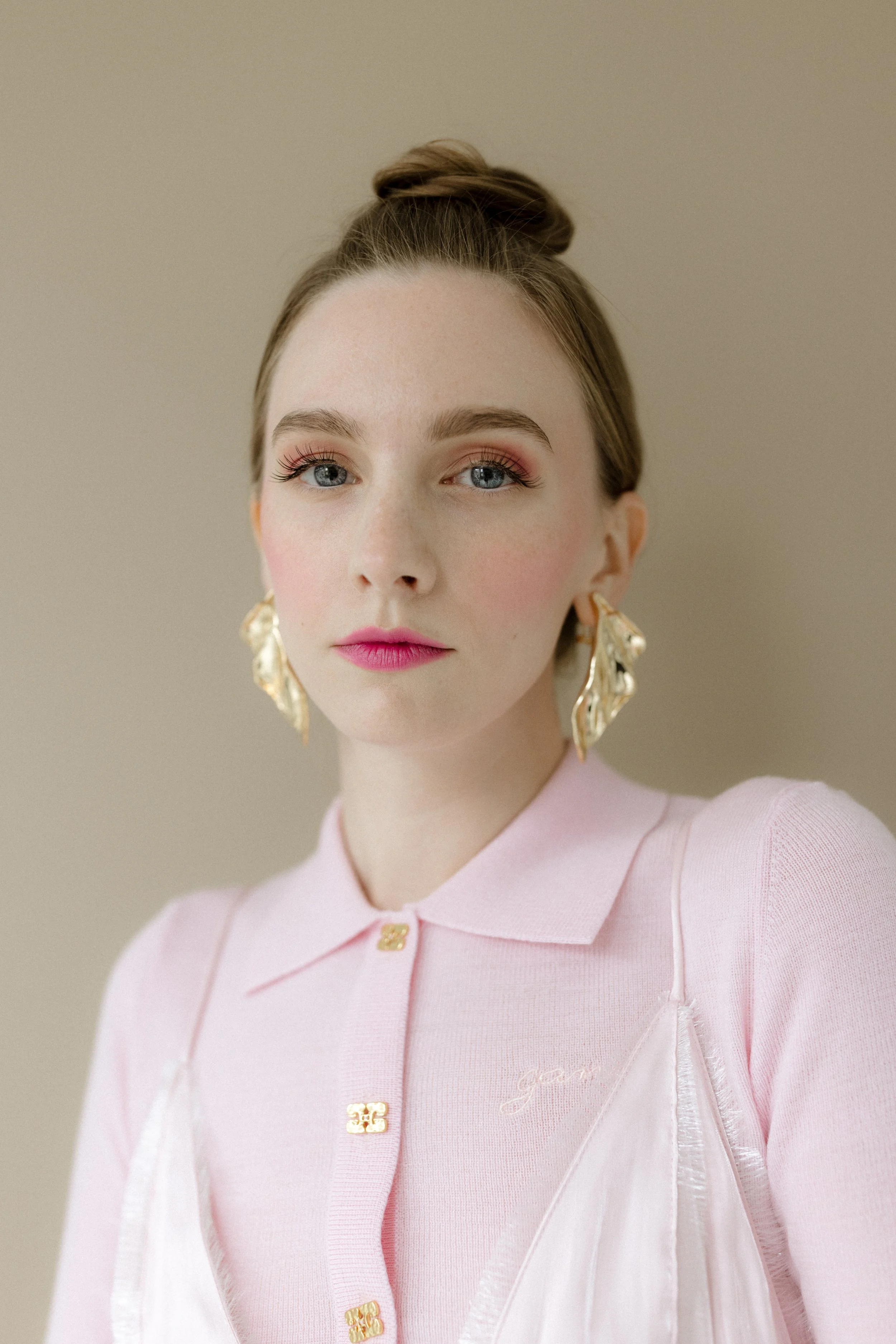
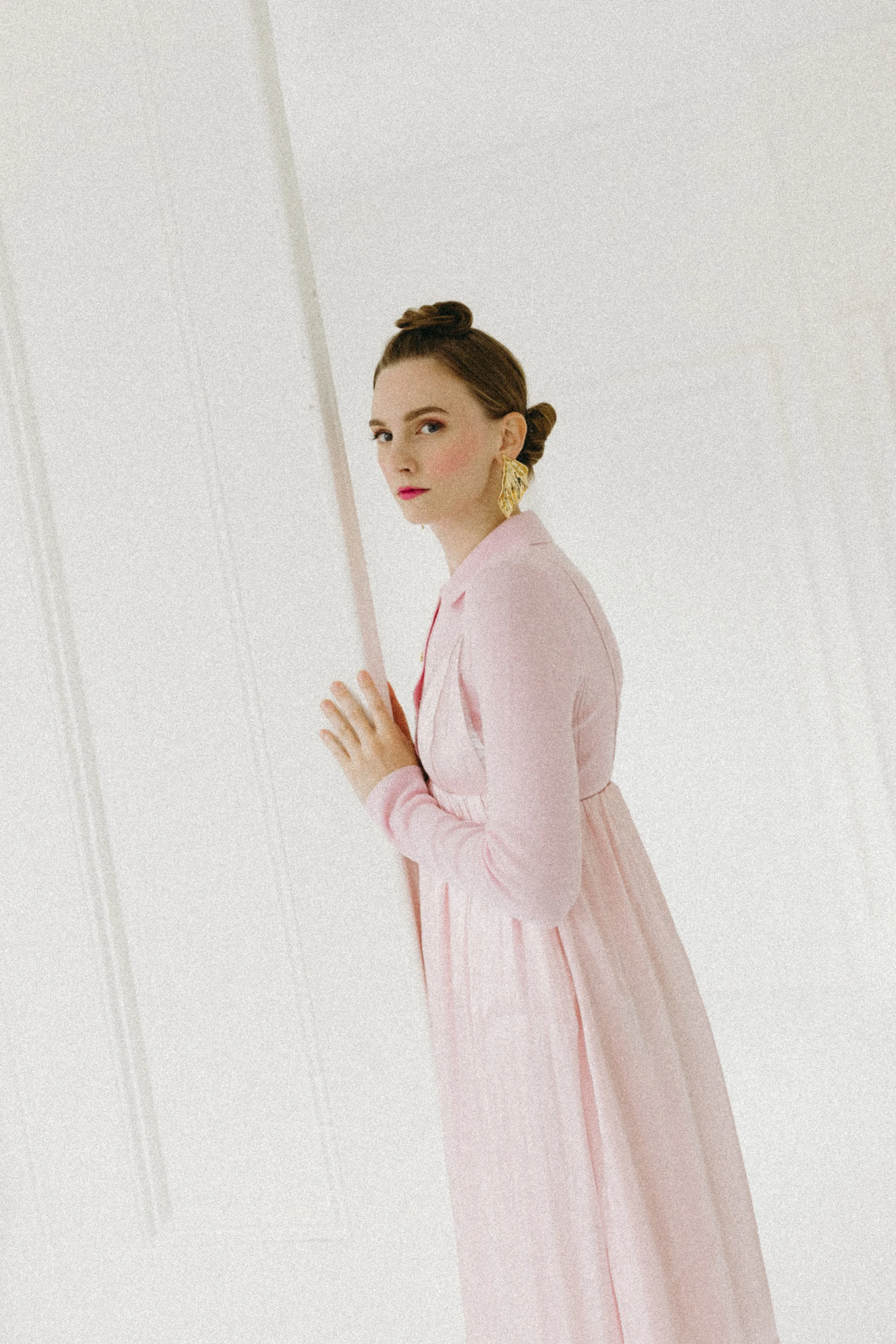
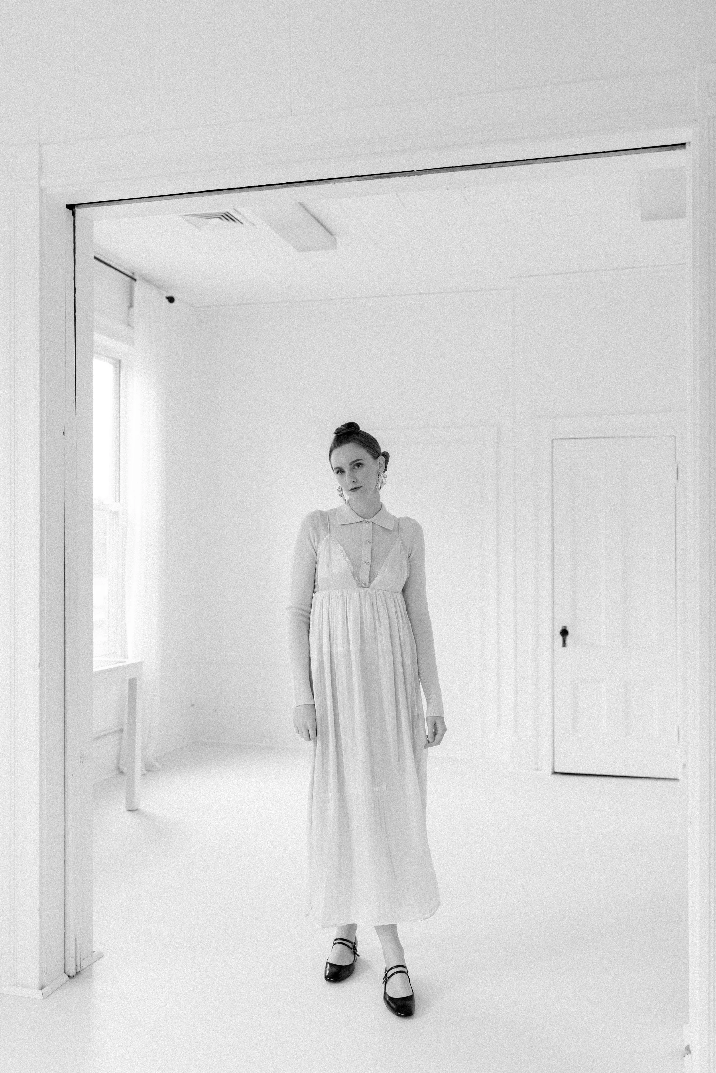
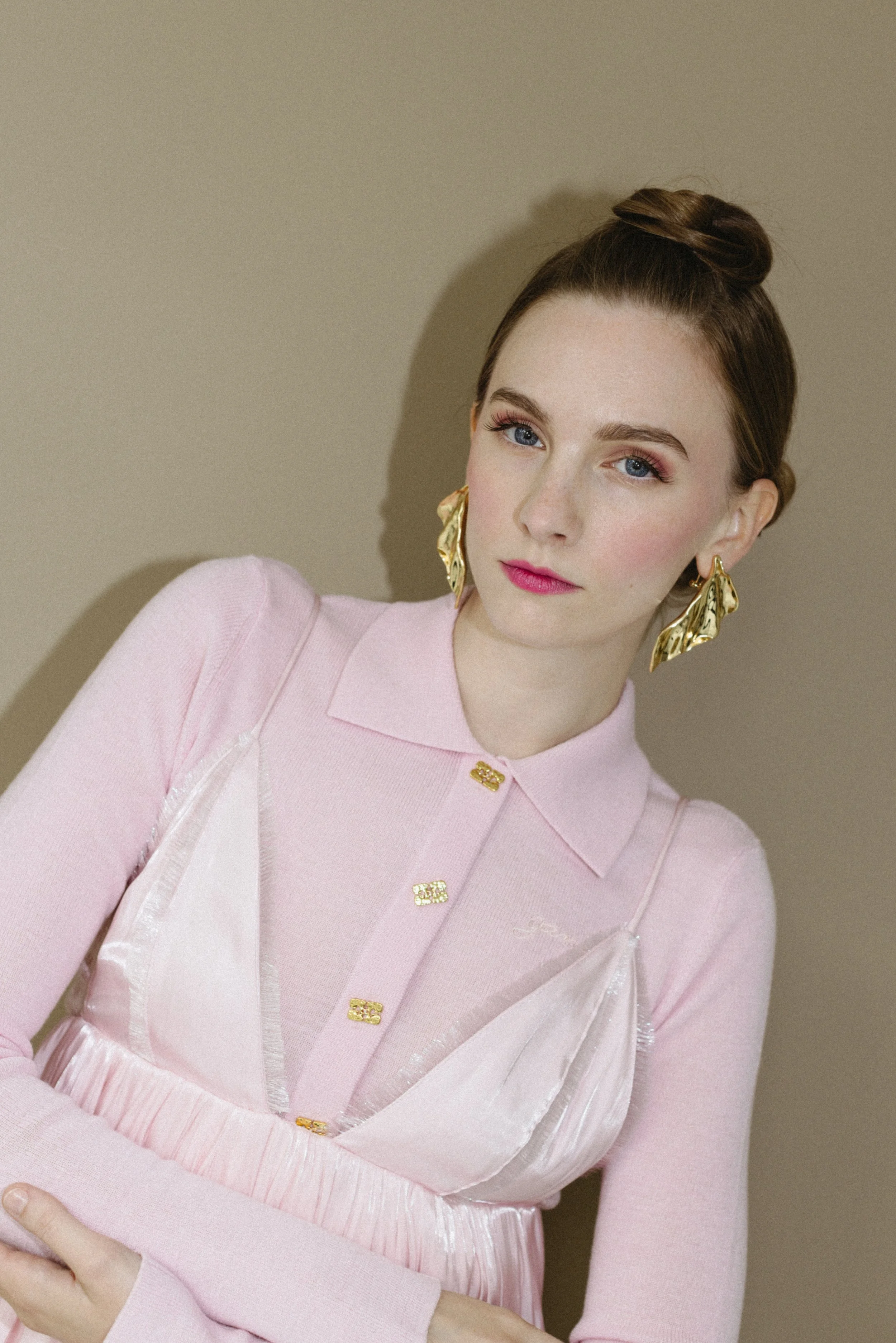
NOT SO PRETTY IN PINK

GANNI CAMPAIGN
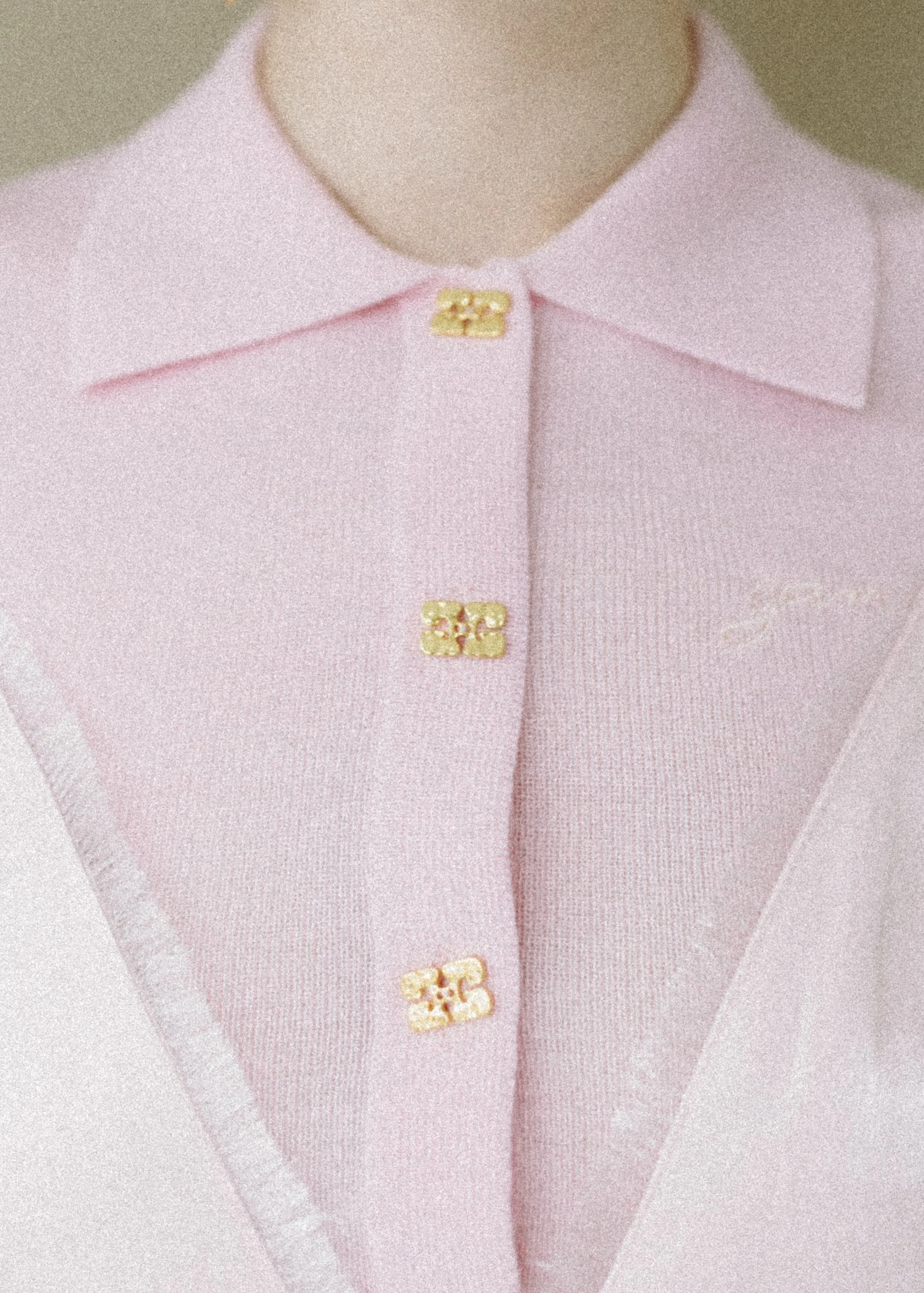
This campaign reimagines femininity through the lens of juxtaposition—softer shade, with sharper edges. The look challenges the clichés of “pretty in pink,” instead framing pink as a color of strength, individuality, and irreverent style. Through playful silhouettes, unexpected textures, and a wink of irony, GANNI celebrates a new kind of pretty: one that’s bold, self-aware, and unapologetically confident.